Color in a room: what changes and what is folklore
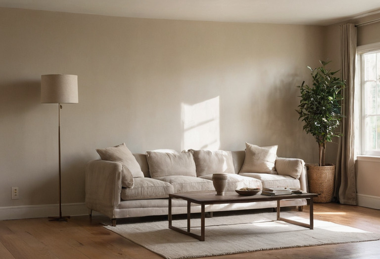
Color changes reflected light, contrast, and the visibility of room boundaries. Reliable selection depends on testing those effects in the actual room, not assigning a universal emotion to each hue.
Color is physical before color is psychological. A painted surface absorbs part of the light reaching it and reflects the remainder toward the eye. The lamp spectrum, daylight, surface texture, adjacent finishes, and visual adaptation all affect the resulting perception.
Personal associations still matter. A green that recalls a childhood kitchen may feel comforting to one client and dated to another. No paint chart can resolve that history, but a disciplined test can expose changes caused by light, scale, and neighboring materials.
A paint chip identifies a candidate. The room, light sources, finish, and viewing distance determine the color that occupants actually experience.
What can paint color measurably change?
Paint color measurably changes spectral reflectance, luminance relationships, and contrast against other surfaces. Light reflectance value, commonly shortened to LRV, summarizes total visible-light reflectance on a scale associated with black at 0 and ideal white at 100. Real architectural paints generally sit between those theoretical endpoints, and manufacturer figures should be treated as product-specific data.
LRV does not describe hue, undertone, gloss, or spectral behavior. Two paints listed at LRV 50 can look unlike each other, and two paints with similar daytime appearances can separate under an LED source. Cross-brand comparisons also deserve caution because published values may come from different instruments, substrates, and measurement procedures.
| Information | Useful for | Does not establish |
|---|---|---|
| LRV on the selected product | Comparing approximate visible-light reflectance | Exact room illuminance or apparent room size |
| Hue or color family | Locating the color relative to other samples | A universal emotional response |
| Correlated color temperature of a lamp | Describing whether the source appears relatively warm or cool | The complete spectrum reaching the paint |
| Gloss or sheen designation | Anticipating reflection character and practical maintenance | Identical appearance across manufacturers |
Surface finish changes the reflection pattern as well. A higher-sheen coating produces stronger specular highlights, while a flatter coating scatters reflections more diffusely. The distinction affects dark walls especially, where grazing light can expose roller marks and substrate defects. The guide to paint sheen, washability, and placement explains why a color approval should always include the final finish.
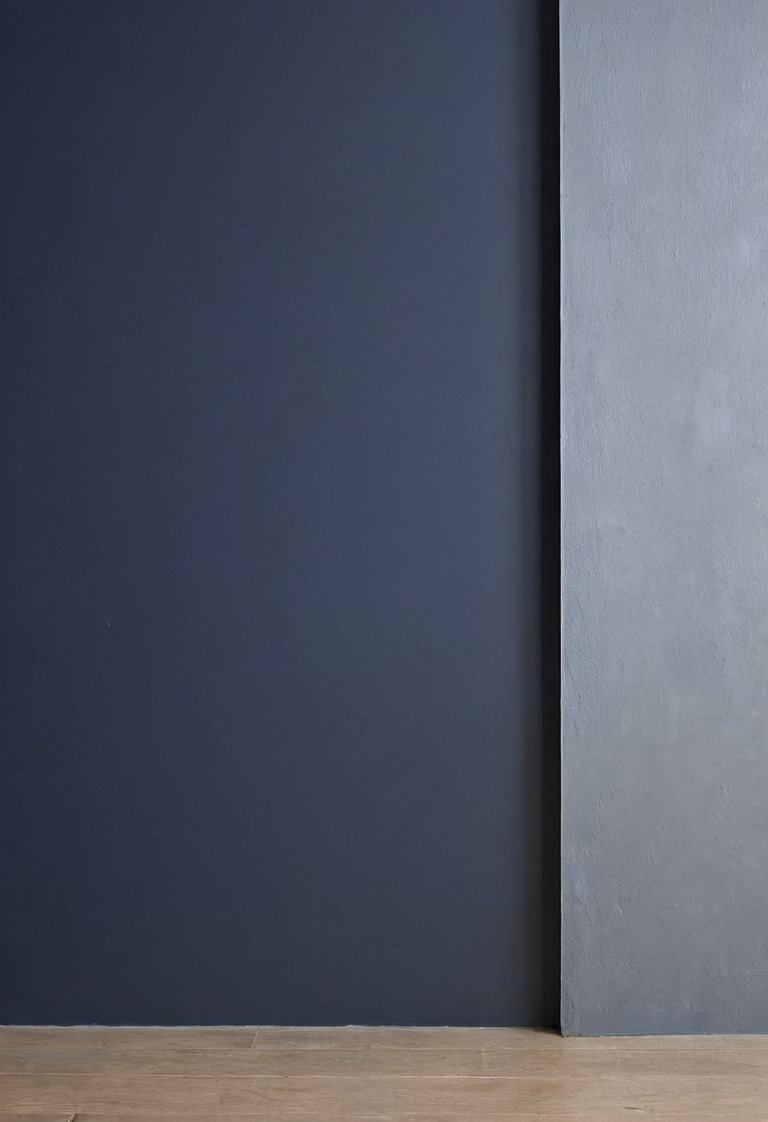
Why does one paint shift under daylight and a 2700 K lamp?
A wall can only reflect wavelengths present in the incoming light. Daylight varies with weather, glazing, orientation, latitude, and time, while two lamps carrying the same 2700 K correlated color temperature can have different spectral distributions. Human visual adaptation further changes the comparison because the eye continually recalibrates its sense of neutral white.
A warm LED source often makes reds and yellows more prominent relative to a cool daylight condition, but the result is not a rule for every pigment. A complex gray may reveal violet, green, or brown components as the source changes. Metamerism describes cases in which two surfaces match under one source and differ under another.
A color-rendering index value such as CRI Ra 90 does not fully predict a particular paint response. The value averages performance across prescribed test colors and does not replace a full spectral comparison. A sample viewed under the specified lamp remains more informative than the lamp carton.
| Condition | Likely observation | Design response |
|---|---|---|
| Sky-dominant daylight without direct sun | Cool components and subtle undertones may become easier to see | Inspect the sample near the principal daytime viewing position |
| Low-angle direct sunlight | Warmth, glare, and surface defects can become more apparent | Check the wall during the actual period of direct exposure |
| 2700 K residential LED | Warm relationships may strengthen, depending on the lamp spectrum | Test the exact lamp model intended for the room |
| Dimmed LED at the evening scene | Some lamps change output or color character when dimmed | Approve paint with the lamp at its normal evening setting |
A successful color decision therefore belongs inside a three-layer lighting plan, not beside it. Window area alone also gives an incomplete picture. Glazing, curtain openness, exterior obstructions, and fabric color influence the daylight described in the guide to daylight and window treatments.
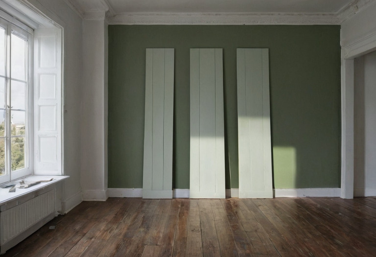
Do pale walls really make a room look larger?
Pale, low-contrast boundaries can make an enclosure feel more open, particularly when the walls and ceiling remain evenly illuminated. Research on apparent room size does not support a reliable conversion between hue or LRV and perceived floor area. Many experiments use images, models, or virtual rooms rather than occupied homes with furniture and changing daylight.
Dark walls can make corners less legible under low illumination, which may blur some boundaries rather than simply making a room feel smaller. Strong contrast can also emphasize geometry. A white ceiling above dark walls may read as a distinct lid, while closely related wall and ceiling colors can soften that junction.
Furniture scale, circulation, visible floor area, and storage often affect spatial judgment more directly than a small paint adjustment. The practical moves in small-flat layouts address usable area rather than promising visual square footage. A restrained scheme can still carry depth when value, sheen, and texture vary, as shown in monochromatic rooms built with one hue.
Texture complicates the pale-versus-dark argument. Rough plaster creates micro-shadows and uneven highlights, while smooth lacquer produces clearer reflections. The journal note on how texture changes light and perception covers that interaction in more detail.
Which color psychology claims should be treated as folklore?
Claims that blue universally calms, red reliably raises aggression, yellow guarantees optimism, or green improves concentration go beyond the available evidence for real interiors. Color research reports context-dependent associations and physiological or behavioral effects, but findings can vary with saturation, task, culture, prior experience, exposure duration, and experimental design. A room prescription cannot be extracted from a color name alone.
A 2014 review of color psychology by researchers Andrew J. Elliot and Markus A. Maier described the field as developing and emphasized the need for careful attention to context and method. The review does not provide a residential palette formula. Marketing summaries often remove those qualifications and turn limited observations into fixed emotional labels.
Designers can still ask useful psychological questions:
- What memories or cultural associations does the client attach to the proposed color?
- Will a highly saturated surface occupy a large part of the seated field of view?
- Does strong contrast support the task, or does the contrast compete with screens, art, or faces?
- Will the room be used mostly in daylight, under dim evening light, or under both conditions?
- Does the client want visual stimulation, low contrast, or a clear focal point?
A home office provides a good example. Wall color may influence comfort, but screen glare, daylight direction, task illuminance, and acoustic distraction have clearer practical mechanisms. The guide to home-office light direction and acoustics addresses those variables without assigning productivity to a hue.
How should a paint color be tested before approval?
A useful test reproduces the final substrate, primer, coat count, sheen, lighting, and surrounding materials at meaningful scale. Alvari & Pers uses large samples because small chips are easily overwhelmed by the existing wall color. The sample should then be observed during the room's normal daytime and evening conditions before any full-room instruction is issued.
- Select no more than three serious candidates for one surface. Numerous near-identical choices make comparison less precise.
- Prepare one sample at least 600 by 900 mm for each candidate. The 600 by 900 mm size is a studio recommendation, not an industry standard.
- Use the specified primer and the paint manufacturer's stated coat system. Record the product, color reference, base, batch, and sheen on the back of each board.
- Paint rigid boards with a surface comparable to the finished wall, or apply test areas directly where later overcoating will not create a visible build-up.
- Leave an unpainted margin only when the comparison requires one. A bright existing wall surrounding the sample can distort judgment through simultaneous contrast.
- Place each sample vertically on every relevant wall. A board lying flat receives different light and does not represent a wall finish.
- Review each candidate under daylight, the specified lamps, and the normal dimmed scene. A simple lux meter can record conditions, but the lux value does not describe spectral quality.
- Position the intended flooring, stone, timber, upholstery, and metal samples beside the paint. Material adjacency often reveals an undertone that looked neutral in isolation.
- Photograph only as a record of location and time. Phone cameras alter white balance, exposure, and saturation, so screen images should not decide approval.
- Sign and retain one approved control sample for the painter, designer, and client to reference during inspection.
The same approval method should include artwork if the wall will function as a backdrop. The guidance on art spacing, light, and wall fixings helps locate the actual visual relationship. Decorative fixtures also need review because bright exposed lamps can overwhelm subtle wall color, a problem covered in feature-lighting scale and glare.
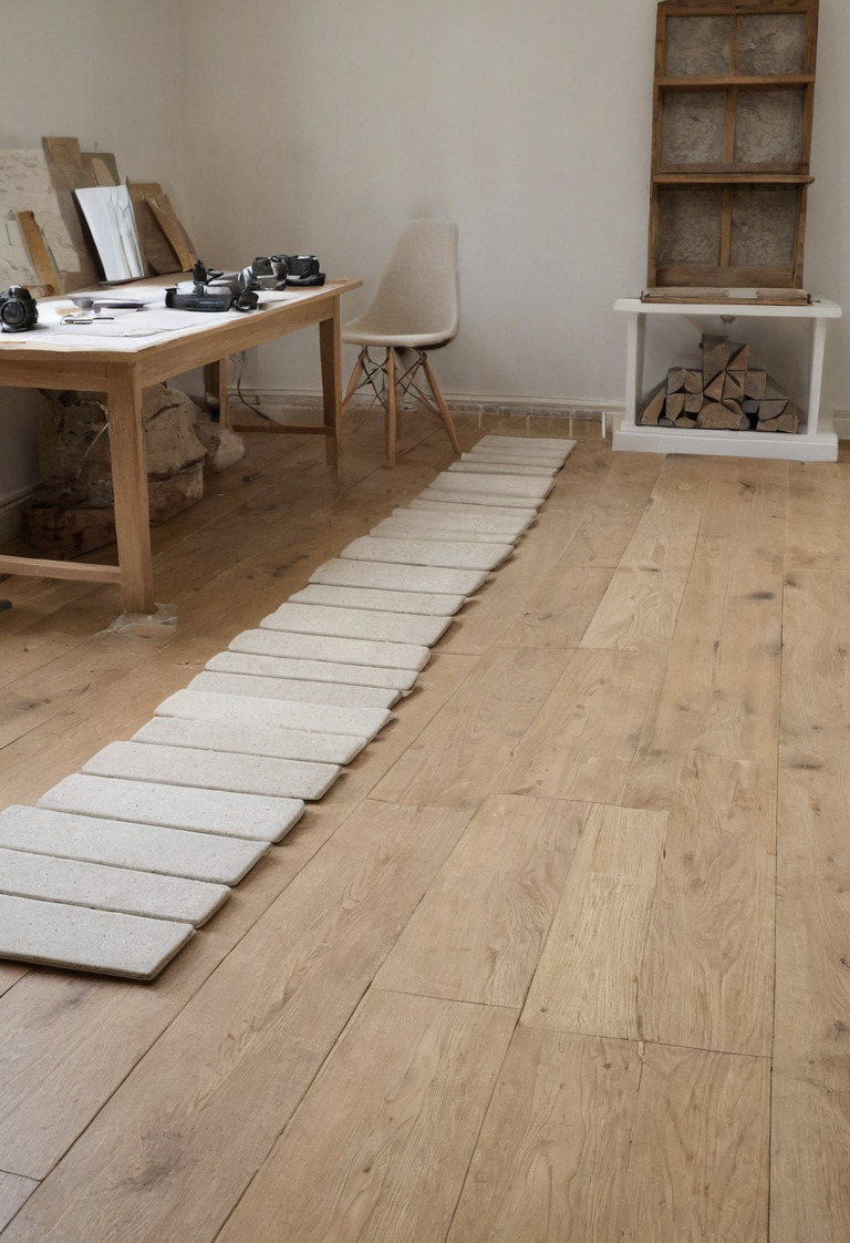
A final color schedule should identify product, manufacturer reference, finish, substrate preparation, primer, coat system, and room surface. Words such as warm white or soft gray are not specifications. A signed physical sample gives the contractor a visible benchmark and gives the client a decision based on the room rather than folklore.
Questions readers ask
- Does a light paint color make a small room look larger?
- A light paint can reduce contrast at room boundaries and increase reflected light, which may make the enclosure feel less visually forceful. No dependable formula converts a paint LRV into an apparent increase in room area.
- What size should a paint sample be?
- A practical studio sample is at least 600 by 900 mm for each candidate color. The sample should receive the specified primer and full coat system on a substrate comparable to the finished wall.
- Why does paint look different at night?
- Daylight and electric lamps contain different spectral distributions, so the wall reflects a different mix of wavelengths. Lamp CCT and color-rendering data help describe the source but cannot predict every paint response.
- Can paint color reliably make a bedroom calmer?
- Research does not support a universal calming color for every person and setting. Glare, darkness, personal association, contrast, and the lighting schedule may matter as much as the nominal hue.