How to Build a Monochrome Room With Depth
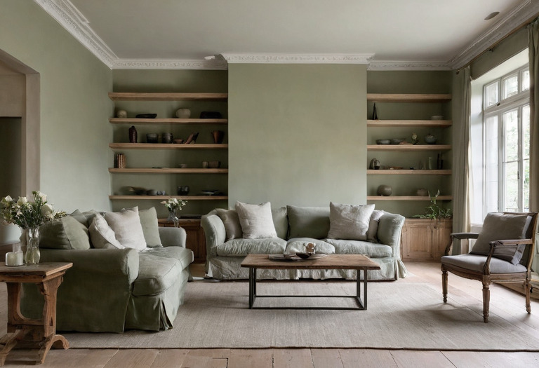
A successful monochrome room repeats one hue without repeating one value. Measured lightness differences, restrained sheen, and one contrasting material keep the surfaces legible.
A monochrome interior is not a room covered in one paint product. A usable scheme holds the hue family steady while changing lightness, surface reflection, weave, grain, and edge definition.
The common claim that monochrome decoration automatically makes a room look larger has no dependable evidence behind it. Reduced contrast can make some boundaries less conspicuous, but layout, daylight, furniture scale, and visible floor area remain stronger variables. Our note on the psychology and folklore of interior color explains why color effects should be treated as context-dependent rather than universal.
How far apart should the light reflectance values be?
Value does most of the separating work in a monochrome room. A practical starting point places large adjoining planes 6 to 12 LRV points apart, while smaller accents can sit 15 to 30 LRV points away. Those intervals are design heuristics, not standards, and every proposed paint requires a physical sample.
Light reflectance value, or LRV, describes the percentage of visible light reflected by a surface under standardized test conditions. The nominal scale runs between 0 for perfect black and 100 for perfect white, although ordinary architectural coatings do not reach either endpoint. Paint manufacturers commonly publish an LRV for each color, but one manufacturer's reading should not be assumed to match another manufacturer's formula perfectly.
A wall at LRV 62 beside millwork at LRV 58 has only a 4-point interval. Similar matte finishes may make that junction look accidental, especially under diffuse daylight. A wall at LRV 62 beside millwork at LRV 50 gives the edge more definition without introducing a different hue.
| Room and hue | Walls | Ceiling | Built-in element | Material break |
|---|---|---|---|---|
| Warm off-white living room | LRV 72 | LRV 84 | LRV 64 shelving | Medium oak floor |
| Muted sage bedroom | LRV 46 | LRV 58 | LRV 38 headboard wall | Natural linen upholstery |
| Deep blue home office | LRV 31 | LRV 43 | LRV 23 cabinetry | Brown walnut desktop |
The ceiling does not always need to be lighter. A wall-and-ceiling match can work in a bedroom or media room where enclosure is intentional. The designer should still test whether corners remain readable after dark, particularly if the room relies on a single central fitting. The practical guidance on bedroom blackout, quiet, and clearances helps separate a visual choice from the room's functional requirements.
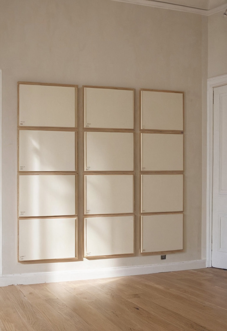
Which sheen levels stop one hue looking flat?
Sheen changes the apparent depth of one color because reflected highlights move as the viewer and light source move. Large surfaces usually need restrained reflection, while trim or cabinetry can accept a modest sheen increase. Manufacturer labels such as matte, eggshell, and satin are not visually equivalent across different paint ranges.
A reliable wall specification starts with a matte or low-sheen washable coating, subject to the room's cleaning demands. Skirting, doors, and fitted joinery can move one manufacturer category higher, provided grazing light does not expose poor preparation. The guide to paint sheen, washability, and room placement covers those trade-offs in detail.
Monochrome fails when every surface returns light in the same way, not simply when every surface shares a hue.
The contractor should prepare reflective finishes more carefully than flat finishes. Satin-coated cabinet doors reveal sanding marks, filled screw heads, and uneven joints that a matte wall can disguise. Custom panels also need agreed shadow gaps and consistent door margins; the required drawing information appears in our note on cabinetry substrates, hardware, and tolerances.
A useful hierarchy for a living room is matte on the ceiling, washable matte on the walls, low satin on painted millwork, and a visibly different weave on upholstery. A bathroom needs a coating system approved by its manufacturer for moisture and cleaning, rather than a sheen selected only for appearance.
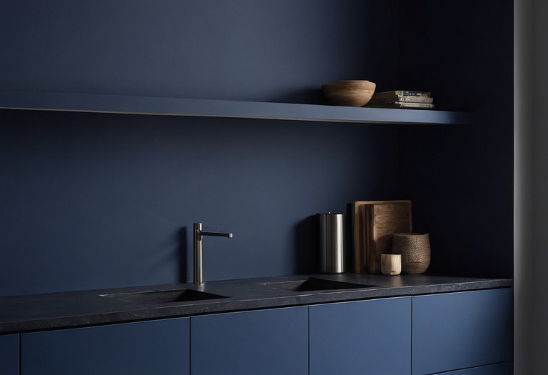
How should lighting be tested against a tonal scheme?
A monochrome palette needs testing under daylight, general lighting, and task lighting because each source changes the visibility of value steps and texture. Lamp color temperature alone cannot predict the result. The designer should also check color rendering, beam direction, dimming behavior, and reflected glare at normal seated and standing positions.
A residential specification might use lamps rated at 2700 K in a warm living room or 3000 K in a working kitchen. Those figures identify correlated color temperature, not quality or color accuracy. A color rendering index of 90 or higher is a reasonable project requirement for residential sources where paint, timber, art, and textiles need credible color rendition, although CRI does not describe every aspect of spectral quality.
Three checks catch most problems:
- The daytime check should compare samples beside the window, on the darkest wall, and near the floor at midday under the room's actual orientation.
- The evening check should run the proposed ambient and task sources at full output and at the intended dimmed scene.
- The glare check should view satin joinery, framed art, and polished surfaces while seated at the main sofa, dining chair, or desk.
A single ceiling fitting tends to flatten upper walls and create hard furniture shadows. A planned combination of ambient, task, and accent sources gives better control; the three-layer lighting method sets out the roles and placement logic. Pendants and decorative fittings also require scale and glare checks, covered in feature lighting heights and focal points.
Window treatment changes the daytime test. Sheer fabric can diffuse direct sun, while lined curtains can remove much of the window-side contrast when closed. The calculations for openness, curtain stack, and fading sit in the guide to daylight and window treatments.
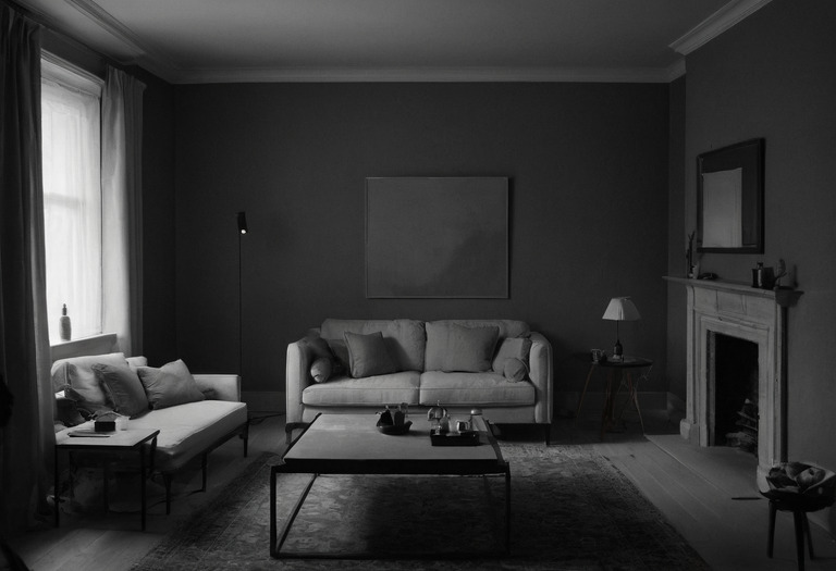
Where does a second material need to interrupt the hue?
A second material becomes necessary where same-hue surfaces lose their boundary, where hands repeatedly touch the finish, or where the room needs a durable visual anchor. Timber, stone, metal, and woven fabric can perform that job without becoming a competing color story. Material selection should follow use and maintenance before appearance.
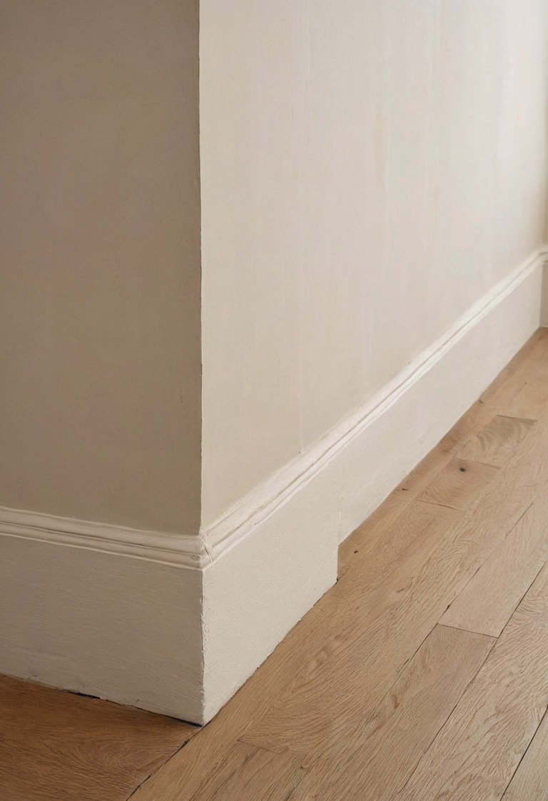
A useful trigger occurs when two adjoining surfaces sit within 3 LRV points and share a similar sheen. The designer should then alter the texture, introduce a shadow gap, or specify a second material. The 3-point threshold is a conservative studio check, not a published perceptual standard.
Common break points include:
- A timber floor beneath walls and upholstery in one pale hue gives the lower plane a readable boundary.
- A stone hearth interrupts same-color walls where heat resistance and cleaning already justify stone.
- A dark metal handle defines a cabinet opening that would otherwise disappear into a flush elevation.
- A coarse woven headboard separates bedding and wall color without requiring a contrasting paint.
Material character should come through structure rather than artificial distressing. Open-pore timber, honed stone, boucle, and brushed metal scatter or absorb light differently, but every material carries cleaning and aging consequences. The notes on how texture changes light and sound and how marble and wood age help test those choices beyond the sample board.
Fabric deserves particular attention because pile direction and weave can make one textile look several shades darker as the viewer moves. Upholstery selection should also account for fiber content, cleaning method, and abrasion testing, as explained in the upholstery durability guide.
What should the sample process include before ordering?
The sample process should reproduce the proposed substrate, primer, coat count, sheen, and nearby materials at a scale large enough to reveal undertone and reflection. Small color chips help with initial editing, but an A3 sample measuring 297 by 420 mm provides a more credible minimum check for a wall finish.
The painter should apply the manufacturer's stated primer and full coat system to rigid sample boards. Each board should be labeled on the back with the color reference, product line, sheen, substrate, primer, application method, and date. A roller texture can look different beside spray-finished cabinetry even when the wet paint came from the same formula.
The client should approve fixed samples in the completed room, not loose samples viewed only on a table. The contractor should hold one signed control sample on site so later batches, touch-ups, and joinery finishes can be compared against the agreed result.
The designer should place each board on every relevant orientation for at least one daytime and one evening review. The review should include the finished floor, curtain fabric, upholstery, stone, and metalwork. An empty white shell gives a misleading amount of reflected light.
Furniture and artwork can supply the small contrast that architecture deliberately withholds. A restrained room does not require invisible objects; minimalism that still supports storage and comfort depends on precise junctions and usable furniture. Artwork also needs deliberate spacing and illumination, addressed in the art hanging and wall-fixing guide.
The final approval should record relationships rather than isolated colors: wall against ceiling, wall against joinery, upholstery against floor, and all four under the intended evening scene. A monochrome palette succeeds when those relationships remain legible without turning into a collection of unrelated neutrals.
Questions readers ask
- Does every surface in a monochrome room need the same paint color?
- No. A workable monochrome scheme uses related versions of one hue at different light reflectance values, with changes in texture and sheen.
- How much LRV difference should adjoining surfaces have?
- A difference of 6 to 12 LRV points is a useful design starting range for large adjoining planes. The range is a studio heuristic, not a building standard, and samples must be checked under the room's actual light.
- Can the ceiling match the walls?
- A matching ceiling can suit a cocooning room, but corners may become difficult to read under flat lighting. A ceiling 8 to 15 LRV points lighter than the walls usually preserves the single-hue effect while clarifying the room's volume.
- Does a monochrome palette make a small room look larger?
- No dependable evidence proves that a single-hue palette makes a room feel larger. Low visual fragmentation can make boundaries less prominent, but furniture scale, daylight, circulation, and contrast also shape perceived space.