How texture changes light, sound and the feel of a room
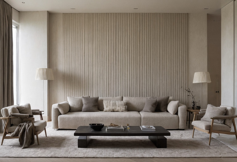
Texture is not a decorative layer added at the end. Surface roughness, gloss, color and construction determine where light appears, where glare develops and how much sound remains in a room.
A room can look flat under diffuse daylight and restless after the electric lights switch on. The materials have not changed, but the direction, size and intensity of each light source have exposed different parts of the surfaces.
Designers often describe texture as warm, rich or tactile. Those descriptions can help a conversation, but no objective evidence proves that a particular texture creates emotional warmth. A useful specification separates measurable surface behavior from personal preference.
Why can two equally pale surfaces light a room differently?
Two pale finishes can return similar quantities of light while sending that light in different directions. A glossy lacquer produces concentrated reflections of windows and lamps, while a matte plaster distributes reflection across a broader field. Color, reflectance, gloss and physical relief must therefore be assessed separately.
Visible light occupies wavelengths commonly described as roughly 380 to 780 nanometers. Surface irregularities near that scale affect microscopic scattering, while larger ridges and grooves create visible highlights and shadows. A deeply brushed board can therefore look darker under grazing light even when the timber itself has not changed color.
| Finish | Typical visual response | Main design risk |
|---|---|---|
| Polished stone or glass | Forms a clear image of bright sources and windows | Reflected glare appears at predictable viewing angles |
| Satin lacquer | Creates broad highlights without a mirror-clear image | Uneven preparation becomes visible across large doors |
| Flat paint or fine plaster | Spreads reflected light and suppresses sharp highlights | Dark colors can still absorb substantial light |
| Ribbed timber or fluted stone | Alternates bright and shaded bands under side lighting | Strong relief can become visually busy across a large area |
| Woven textile | Produces soft local shadows that change with fiber direction | Pile direction can make adjacent panels appear mismatched |
Reflectance and gloss are not interchangeable. Reflectance describes how much incident light a surface returns, while gloss concerns the concentration of that reflection around the specular direction. Standard gloss measurements commonly use geometries of 20, 60 or 85 degrees, but a gloss-unit reading cannot describe relief, color or the reflected image by itself.
The guide to paint sheen and washability explains why manufacturers' labels such as matte and satin are not reliable comparison units across different product lines. The relationship between color and measured light also matters because a rough white surface can remain brighter overall than a polished charcoal surface.
Which finishes create glare under an actual lighting scheme?
Glare develops when a bright source or its reflection enters a relevant sightline with excessive contrast. Finish selection cannot be separated from luminaire position, beam direction and furniture layout. A polished surface may work under broad indirect light yet become uncomfortable beneath a narrow spotlight aimed toward seated eyes.
The law of reflection places the reflected ray at the same angle to the surface normal as the incoming ray. A reflected image can therefore be anticipated on drawings, especially at dining tables, kitchen counters, television walls and glossy cabinet banks.
A three-layer lighting plan should identify ambient, task and accent sources before final finish approval. Decorative pendants require a separate check on hanging height and glare because a visible bulb and a reflected bulb can create two bright sources in one sightline.
A matte finish hides a reflected lamp, but only a change in reflectance, source position or light output changes the total light balance.
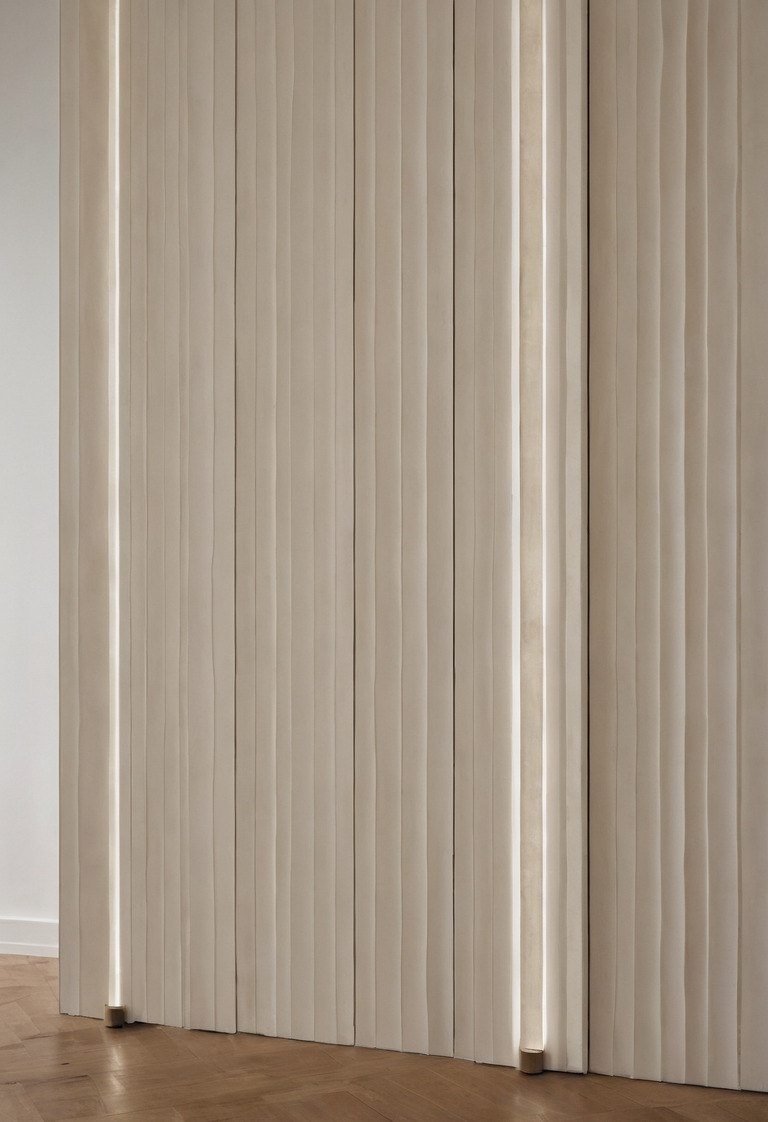
Grazing light deserves deliberate use. A light placed close to a wall magnifies every trowel mark, open joint and sanding wave. The same arrangement can give intentional depth to split-face stone or ribbed joinery. Custom cabinetry drawings and tolerances should identify visible grain direction and joint alignment before integrated lighting fixes those details in sharp relief.
Daylight creates the same issue at a larger scale. Low morning or evening sun reveals surface relief, while a sheer curtain broadens the source and softens shadows. The note on daylight, curtain openness and fading covers the performance differences between an unobstructed window and filtered daylight.
How much can decorative texture improve acoustics?
Decorative roughness alone rarely provides meaningful sound absorption. Dense plaster, stone, glass and timber reflect most domestic speech frequencies even when their surfaces look irregular. Porous textiles, open fibers and purpose-designed cavities convert more sound energy into heat, but performance depends on thickness, mounting, backing and frequency.
Acoustic absorption is expressed by a coefficient between 0 and 1 at a stated frequency. A coefficient of 0 means no incident sound energy is absorbed under the test condition, while a coefficient of 1 means all incident energy is absorbed. Real products report different values across frequency bands rather than one universal result.
- Painted plaster and concrete
- Dense painted assemblies generally provide little absorption. Surface stippling should not be treated as acoustic treatment.
- Carpet with underlay
- The porous system can reduce mid-frequency and high-frequency reflections. Underlay composition and total thickness change the result.
- Pleated curtains
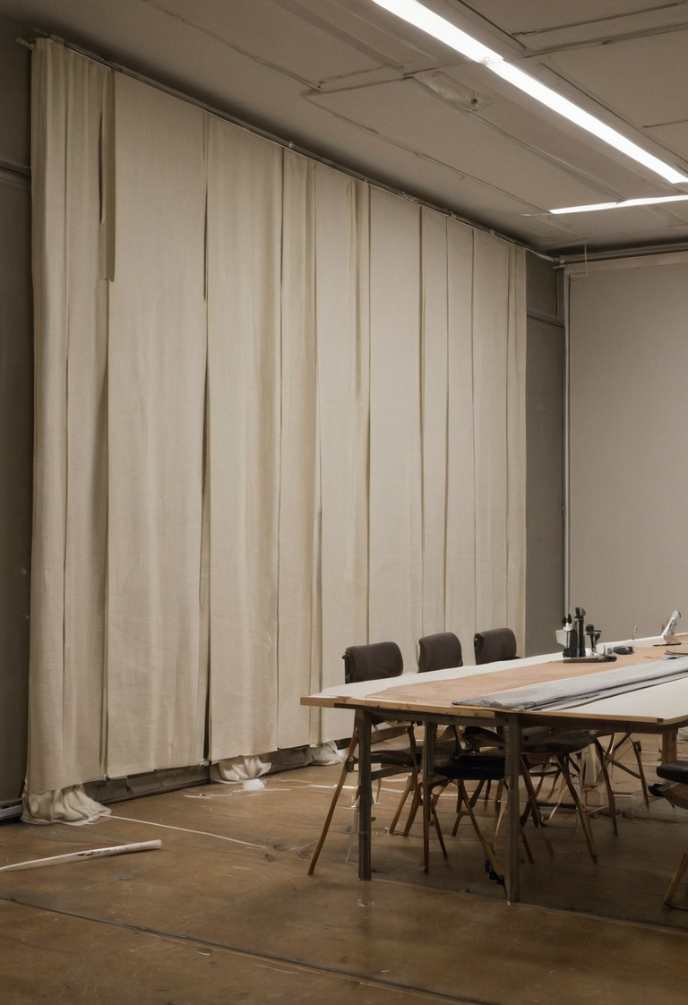
- Fabric weight, fullness and the air space behind the curtain govern performance. A taut fabric mounted directly against glass does less acoustic work.
- Timber slats
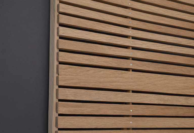
- Slats fixed directly to a hard wall remain largely reflective. Spacing, porous backing and cavity depth can turn the assembly into a tested absorber.
- Upholstered furniture
- Foam, fiber and fabric add local absorption, but movable furniture cannot guarantee uniform room performance.
A useful supplier document reports laboratory results under ISO 354, which measures sound absorption in a reverberation room. The report should show frequency-specific values, commonly including one-third-octave data, rather than only a marketing description such as acoustic felt.
Room absorption can be estimated as A = Σ(αS), where A is equivalent absorption area, α is the coefficient for each surface at the selected frequency, and S is that surface area in square meters. The equation explains why a tiny upholstered panel cannot correct a large reflective room, even if the panel itself performs well.
The upholstery fabric specification guide helps distinguish visual weave, fiber content and cleanability. A quiet home office layout also needs control of doors, ventilation noise and sound transmission, not just soft finishes.
How can three or four textures coexist without visual noise?
A controlled room assigns each texture a job rather than counting materials mechanically. One surface can form the quiet background, one can establish grain or direction, one can provide tactile softness, and one can act as a small reflective accent. Repetition of color, joint lines or scale connects the group.
No evidence supports the popular 60-30-10 decorating ratio as a universal rule. Material area should respond to room geometry, viewing distance, daylight and maintenance instead. A strongly veined slab may need more quiet wall area than a fine-grained oak floor, even when both materials occupy similar measured areas.
A practical sequence works as follows:
- The studio selects the largest fixed plane first, usually the floor, walls or full-height joinery.
- The studio introduces one contrasting tactile family, such as wool against stone or linen against lacquer.
- The studio repeats one attribute across materials, such as a shared warm gray color or a consistent vertical direction.
- The studio reserves the strongest relief or shine for an area that lighting and sightlines can support.
Material authenticity does not require every natural pattern to compete. The maintenance comparison for marble and timber surfaces is relevant because patina, filling, sealing and grain variation alter the composition after installation. A monochromatic room with varied sheen can carry substantial depth without introducing several unrelated colors.
What should the sample review actually test?
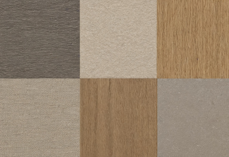
A sample review should reproduce direction, distance and light rather than merely confirm color at a desk. The contractor and designer should inspect sheen, joints, grain, edge treatment and cleaning marks under daylight and every specified electric-light scene. Large repeating materials also need enough area to reveal variation.
An A3 sheet measuring 297 by 420 millimeters is a useful studio minimum for a paint or decorative-plaster drawdown, although the dimension is a working practice rather than an industry standard. Veneer, stone and patterned fabric often require larger control samples because a small cutting can omit knots, veins or repeats.
The review should include these checks:
- The team should inspect each sample both frontally and at an oblique angle that reveals gloss and waviness.
- The team should place vertical finishes vertically because fiber, pile and metallic particles can read differently after rotation.
- The team should view the assembly from the main seated and standing positions, not only at arm's length.
- The contractor should build a junction sample where stone, timber, plaster or metal meet, because edge details create much of the perceived depth.
- The client should mark the approved face and orientation before procurement begins.
The minimalist detailing guide explains why fewer visible materials demand tighter junctions rather than less design work. Texture succeeds when light behavior, acoustic construction, cleaning and tolerances agree. A material board can start that discussion, but only a correctly lit, correctly oriented sample can settle it.
Questions readers ask
- Do rough walls absorb more sound than smooth walls?
- Most decorative rough walls remain acoustically reflective because plaster, stone and concrete are dense. Meaningful absorption usually requires a porous layer, an air cavity or a tested acoustic assembly.
- Does matte paint make a dark room brighter?
- Matte paint reduces sharp reflections, but brightness depends mainly on the paint's light reflectance and the available illumination. A pale matte paint can return more light than a dark glossy paint.
- How many textures should one room contain?
- No research supports a fixed number. A practical scheme often uses three or four clearly different material roles, while repeated colors and controlled joints keep the composition coherent.
- Can curtains replace acoustic panels?
- Heavy, pleated curtains with an air space can reduce some mid-frequency and high-frequency reflections. Curtains rarely provide enough low-frequency absorption for a difficult music room or home cinema.